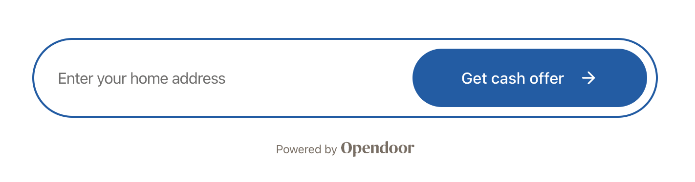
Address Entry
The AddressEntry component provides a complete address input experience with real-time address suggestions, manual entry fallback, and validation.
Basic usage
import {  OpendoorProvider,  AddressEntry,} from '@opendoor/partner-sdk-client-react';import { OpendoorClient } from '@opendoor/partner-sdk-client-js-core';
const client = new OpendoorClient({ baseURL: '/api/opendoor/v1' });
function App() { return ( <OpendoorProvider client={client}> <AddressEntry onAddressSelect={(address) => { console.log(address.street1, address.city, address.state); }} /> </OpendoorProvider> );}<script setup lang="ts">import { OpendoorProvider, AddressEntry, OpendoorClient,} from '@opendoor/partner-sdk-client-vue';import '@opendoor/partner-sdk-client-vue/dist/style.css';import type { Address } from '@opendoor/partner-sdk-client-js-core';
const client = new OpendoorClient({ baseURL: '/api/opendoor/v1' });
const handleSelect = (address: Address) => { console.log(address.street1, address.city, address.state);};</script>
<template> <OpendoorProvider :client="client"> <AddressEntry @address-select="handleSelect" /> </OpendoorProvider></template>Props
| Prop | Type | Default | Description |
|---|---|---|---|
onAddressSelect | (address: Address) => void | Promise<void> | Required | Called when user selects an address |
appearance | OpendoorAppearance | Default theme | Visual customization |
enableAddressSuggestions | boolean | true | Enable address suggestions |
debounceMs | number | 300 | Debounce delay for address suggestions |
disabled | boolean | false | Disable all interaction |
placeholderText | string | "Enter your home address" | Input placeholder |
buttonText | string | "Get cash offer" | Submit button text |
showButton | boolean | true | Show integrated submit button |
buttonIcon | ReactNode | Arrow icon | Custom button icon |
inputIcon | ReactNode | None | Icon inside the input |
manualEntryText | string | "Enter address manually instead" | Manual entry link text |
showAttribution | boolean | false | Show “Powered by Opendoor” below input |
In Vue, props use kebab-case in templates (e.g., show-attribution instead of showAttribution, placeholder-text instead of placeholderText). Callbacks become emits — see the events table below.
| Prop | Type | Default | Description |
|---|---|---|---|
appearance | OpendoorAppearance | Default theme | Visual customization |
enable-address-suggestions | boolean | true | Enable address suggestions |
debounce-ms | number | 300 | Debounce delay for address suggestions |
disabled | boolean | false | Disable all interaction |
placeholder-text | string | "Enter your home address" | Input placeholder |
button-text | string | "Get cash offer" | Submit button text |
show-button | boolean | true | Show integrated submit button |
manual-entry-text | string | "Enter address manually instead" | Manual entry link text |
show-attribution | boolean | false | Show “Powered by Opendoor” below input |
Slots:
button-icon— custom button icon (replaces the default arrow)input-icon— icon inside the input field
Callbacks & Events
| Callback | Type | When it fires |
|---|---|---|
onAddressSelect | (address: Address) => void | Promise<void> | User selects an address |
onReady | () => void | Component mounted |
onChange | (address: Partial<Address>) => void | Any field changes |
onAddressSuggestionsStart | (query: string) => void | Address suggestions API call starts |
onAddressSuggestionsComplete | (suggestions: Address[]) => void | Address suggestions results received |
onValidationError | (error: string) => void | Manual submit validation fails |
onError | (error: Error) => void | Any error occurs |
In Vue, callbacks are emitted as kebab-case events instead of onCamelCase callback props:
| Vue emit | Payload | When it fires |
|---|---|---|
@address-select | Address | User selects an address |
@ready | — | Component mounted |
@change | Partial<Address> | Any field changes |
@address-suggestions-start | string | Address suggestions API call starts |
@address-suggestions-complete | Address[] | Address suggestions results received |
@validation-error | string | Manual submit validation fails |
@error | Error | Any error occurs |
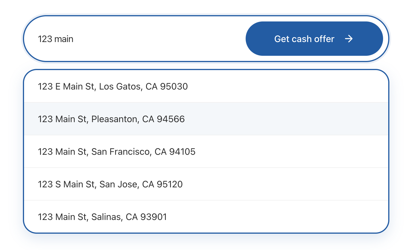
How address suggestions work
- User types at least 3 characters
- After the debounce delay, the component calls
client.getAddressSuggestions(query) - This request goes to your backend → server SDK → Opendoor’s address service
- Suggestions appear in a dropdown
- User clicks a suggestion →
onAddressSelectfires with the fullAddress
If no suggestions match, the component shows a “Enter address manually” link that reveals a form with street, city, state, and ZIP fields.
After address selection
When onAddressSelect fires, check if the address needs a unit number before creating the offer:
const handleAddressSelect = async (address: Address) => {  // Check if the building has multiple units  const { requiresUnitNumber } = await client.checkAddressUnit(address);
if (requiresUnitNumber) { // Show AddressUnitConfirmation to collect unit/apt/floor setNeedsUnit(true); } else { // Proceed to create offer const offer = await client.createOffer({ address }); }};<script setup lang="ts">import { ref } from 'vue';import { OpendoorClient } from '@opendoor/partner-sdk-client-vue';import type { Address } from '@opendoor/partner-sdk-client-js-core';
const client = new OpendoorClient({ baseURL: '/api/opendoor/v1' });const needsUnit = ref(false);
const handleAddressSelect = async (address: Address) => { // Check if the building has multiple units const { requiresUnitNumber } = await client.checkAddressUnit(address);
if (requiresUnitNumber) { // Show AddressUnitConfirmation to collect unit/apt/floor needsUnit.value = true; } else { // Proceed to create offer const offer = await client.createOffer({ address }); }};</script>See the AddressUnitConfirmation guide for the full flow.
Attribution
Show a “Powered by Opendoor” badge below the component with the showAttribution prop:
<AddressEntry showAttribution={true} onAddressSelect={handleAddressSelect} /><AddressEntry :show-attribution="true" @address-select="handleSelect" />The attribution text and logo color come from the colorTextTertiary theme variable.