DTC Onboarding Flow
The DtcOnboardingFlow component renders the traditional (non-instant-offer) questionnaire, matching the DTC flow on opendoor.com. It presents 17 pages of questions — one per screen — with a two-column layout on desktop and stacked layout on mobile. It handles navigation, validation, conditional page skipping, and fires onSubmit when the user completes the flow.
Basic usage
import { DtcOnboardingFlow } from '@opendoor/partner-sdk-client-react';import { OpendoorClient } from '@opendoor/partner-sdk-client-js-core';
const client = new OpendoorClient({ baseURL: '/api/opendoor/v1' });
function App({ address }) { return ( <DtcOnboardingFlow address={address} appearance={{ theme: 'minimal' }} partnerLogoUrl="/your-logo.svg" onSubmit={async (answers) => { const offer = await client.createOffer({ address, ...answers }); }} onClose={() => console.log('User closed the flow')} /> );}<script setup lang="ts">import { DtcOnboardingFlow, OpendoorClient } from '@opendoor/partner-sdk-client-vue';import '@opendoor/partner-sdk-client-vue/dist/style.css';import type { Address } from '@opendoor/partner-sdk-client-js-core';
const props = defineProps<{ address: Address }>();const client = new OpendoorClient({ baseURL: '/api/opendoor/v1' });
const handleSubmit = async (answers: Record<string, unknown>) => { const offer = await client.createOffer({ address: props.address, ...answers });};
const handleClose = () => console.log('User closed the flow');</script>
<template> <DtcOnboardingFlow :address="address" :appearance="{ theme: 'minimal' }" partner-logo-url="/your-logo.svg" :on-close="handleClose" @submit="handleSubmit" /></template>
DtcOnboardingFlowdoes not require<OpendoorProvider>. It manages its own state internally.
Props
| Prop | Type | Default | Description |
|---|---|---|---|
address | Address | Required | The selected property address |
onSubmit | (answers) => void | Required | Called when user completes all pages |
partnerLogoUrl | string | - | Partner logo URL (shown before the Opendoor logo in header) |
appearance | OpendoorAppearance | { theme: 'minimal' } | Visual theme configuration |
initialAnswers | Record<string, AnswerValue> | - | Prefill data (e.g., from address lookup) |
market | string | - | Market identifier for region-specific questions |
onClose | () => void | - | Called when close (X) button is clicked |
In Vue, props use kebab-case in templates (e.g., partner-logo-url, initial-answers). The onClose handler is passed as a prop (:on-close="fn"), not an emit. Callbacks that are emits use @event-name syntax — see the events table below.
| Prop | Type | Default | Description |
|---|---|---|---|
address | Address | Required | The selected property address |
partner-logo-url | string | - | Partner logo URL (shown before the Opendoor logo in header) |
appearance | OpendoorAppearance | { theme: 'minimal' } | Visual theme configuration |
initial-answers | Record<string, AnswerValue> | - | Prefill data (e.g., from address lookup) |
market | string | - | Market identifier for region-specific questions |
:on-close | () => void | - | Called when close (X) button is clicked (prop, not emit) |
Callbacks & Events
| Callback | Type | When it fires |
|---|---|---|
onReady | () => void | Component mounted and ready |
onSubmit | (answers) => void | User completed all pages |
onPageChange | (pageIndex, pageId) => void | User navigates between pages |
onAnswerChange | (key, value) => void | Any answer changes |
onError | (error: Error) => void | Validation or internal error |
onClose | () => void | Close button clicked |
In Vue, callbacks are emitted as kebab-case events instead of onCamelCase callback props:
| Vue emit | Payload | When it fires |
|---|---|---|
@submit | Record<string, unknown> | User completed all pages |
@ready | — | Component mounted and ready |
@page-change | pageIndex, pageId | User navigates between pages |
@answer-change | key, value | Any answer changes |
@error | Error | Validation or internal error |
onClose is a prop in Vue (:on-close="fn"), not an emit, because it controls the close button behavior.
Pages
The component renders 17 pages. Pages with conditional visibility are automatically skipped when their conditions are not met (e.g., HOA sub-pages are skipped when HOA = No).
| # | Page | What it collects |
|---|---|---|
| 1 | Confirm Home Details | Dwelling type, beds, baths, sqft, stories, basement, year, pool |
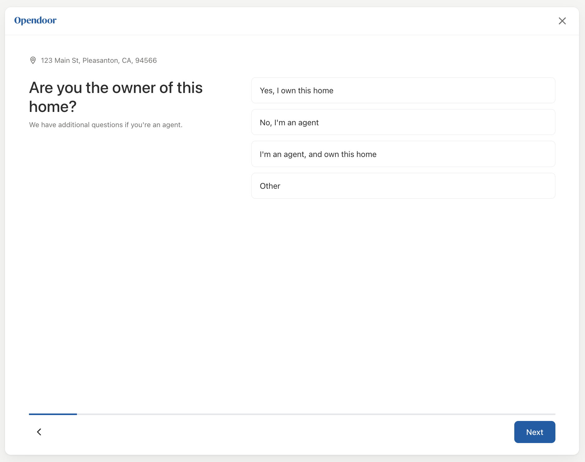
| 2 | Ownership | Relationship to owner (owner, agent, other) |
| 3 | Sale Timeline | When the user needs to sell |
| 4-7 | Room Condition (×4) | Kitchen, bathroom, living room, exterior — 5-level image select |
| 8 | HOA | Is the home part of an HOA? |
| 9 | HOA Type | Age-restricted, gated community (if HOA = Yes) |
| 10 | HOA Guard | Guard at entrance (if gated community) |
| 11 | HOA Fees | Monthly fees (if HOA = Yes, optional) |
| 12 | Eligibility Criteria | Disqualifying property features (solar, foundation, etc.) |
| 13 | Upgrades | Has the home had upgrades? |
| 14 | Homebuilder | Working with a homebuilder? |
| 15 | Homebuilder Name | Which homebuilder (if yes) |
| 16 | Homebuilder Details | Sales associate email + community name (if yes) |
| 17 | Contact Info | Name, email, phone, SMS consent |
Prefilling answers
Pass initialAnswers to pre-populate fields (e.g., from property data):
<DtcOnboardingFlow address={address} initialAnswers={{ 'home.dwelling_type': 'single_family', 'home.bedrooms': 3, 'home.bathrooms.full': 2, 'home.above_grade_sq_ft': 1800, 'home.year_built': 2010, }} onSubmit={handleSubmit}/><DtcOnboardingFlow :address="address" :initial-answers="{ 'home.dwelling_type': 'single_family', 'home.bedrooms': 3, 'home.bathrooms.full': 2, 'home.above_grade_sq_ft': 1800, 'home.year_built': 2010, }" @submit="handleSubmit"/>Answer keys
Answers use dot-notation keys matching the server-side schema:
home.dwelling_type, home.bedrooms, home.bathrooms.full, home.above_grade_sq_ft,home.kitchen_seller_score, home.hoa, home.hoa_type, home.eligibility_criteria,seller.relation_to_owner, seller.sale_timeline, seller.full_name, seller.email,seller.phone_number, seller.working_with_home_builder, ...When you call client.createOffer() or client.updateOffer(), the server SDK maps these keys to the GraphQL schema automatically.
Styling
The component uses the appearance prop for theming. It defaults to the minimal theme. All standard tokens apply — colors, fonts, spacing, borders, and radii are shared with other SDK components like AddressEntry and QualificationQuestions:
<DtcOnboardingFlow address={address} appearance={{ theme: 'minimal', variables: { colorPrimary: '#003366', fontFamily: '"Inter", sans-serif', colorCardBorderSelected: '#003366', colorCardBackgroundSelected: '#f0f5ff', }, }} onSubmit={handleSubmit}/><DtcOnboardingFlow :address="address" :appearance="{ theme: 'minimal', variables: { colorPrimary: '#003366', fontFamily: '\"Inter\", sans-serif', colorCardBorderSelected: '#003366', colorCardBackgroundSelected: '#f0f5ff', }, }" @submit="handleSubmit"/>The card selection tokens (colorCardBackground, colorCardBorder, colorCardBorderSelected, colorCardBackgroundSelected) control the selectable card components used for radio and checkbox inputs.
See the Styling & Themes guide for all available tokens.
Resetting the form
To reset the component (e.g., start over with a different address), change the key prop:
<DtcOnboardingFlow key={address.street1} address={address} onSubmit={handleSubmit}/><DtcOnboardingFlow :key="address.street1" :address="address" @submit="handleSubmit"/>